Design
Studio
Research, Production & Editing on Sustainability
We were given a task to record a short video explaining the topic ‘Sustainability’ on VERY short notice. Feeling flustered, I tried to come up with an idea that does not just talk about the meaning of sustainability which many people might talk about and felt redundant. Therefore, I decided to shed some light on certain underdogs that contributed to the effect of climate change with the method of regenerative sustainability, with my own quirky take on the setting of the video.
So it begs the question:
What the heck exactly is regenerative sustainability?
After researching more about regenerative sustainability, I found out that it is a process-oriented whole systems approach to design. The term “regenerative” expresses processes that restore, renew, or revitalize their own set of resources.
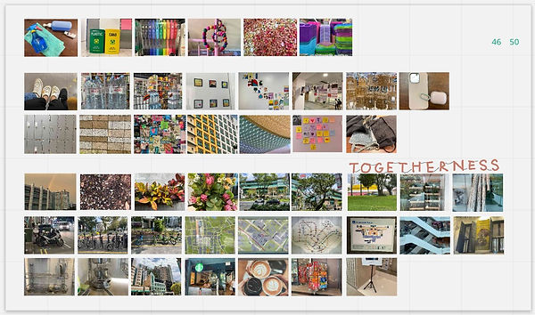
Visual Literacy on "Togetherness"
My group was tasked to take pictures that enables the audience to think about the word “Togetherness”. I found this challenge difficult with the limited space constraint of the neighbourhood around campus and the short time of an hour, but I and my group tried to make do while exploring the neighbourhood. Trying to avoid the literal meaning of people or a group of objects, we derived the word into different meanings into our mind map:
We arranged and presented our photos into 3 subcategories: Colour Harmony, Arrangement and Structure. After presenting our board and explaining our definition of “Togetherness”, our class marked our photos as to whether the photos that we took suit the word. Here is the result:
So. what direction we should take so that people can single-handedly think of the word Togetherness?
About 30 out of 50 pictures that we took match the meaning we described, and we decided to focus more on the meaning of “Structure”. To us, it means order, stability, being together or formed together for a sense of security as opposed to isolation, whether it comes to people or animals or even objects. It can be small components that help contribute to a bigger picture or a network of connections to form an entire entity.
Once confirming the direction of the intended message, we replaced the photos that our peers wouldn’t think that it fits the theme. Here is the result:


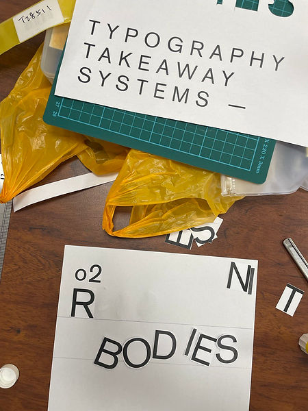
Learning Typeface Anatomies
We also learned another set of fundamental skills, which is Typography, where we learn about typeface anatomies such as Serif, Sans Serif, Slab serif, Grotesque/Neo grotesque, etc. It was interesting to learn more in-depth about typography which we usually do not really go into but play a part in the visual to evoke different messages.
These are some of the examples I found outside the campus in which the Typography used caught my interest for various reasons:
How are the font choices help enunciate the message further to the audience?
Trying out different fonts onto Headers, Sub-headers and Body was fun for me as I physically get to experiment with the font given to create my own piece.
Learning Typesetting
After experimenting with the different font choices to create our own typeface structure, I also tried to understand the different parts of typesetting such as Tracking, Kerning, and Leading.

Some of the few pointers I have learned are how certain fonts needed to be bigger in size and tracking to optically fit in the print and to balance out the rest of the typesetting.
Is there a better way to arrange the components to show the intended message without losing interest from the audience?
The kerning in the paragraph also needs to be neutrally arranged so as to not confuse or overwhelm the audience when reading.